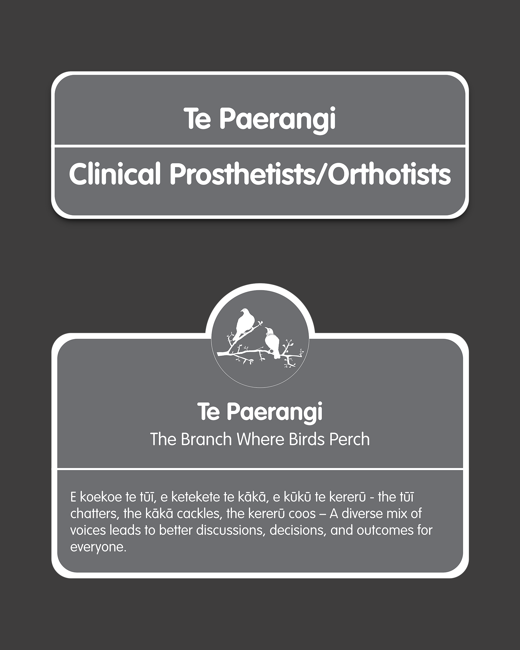
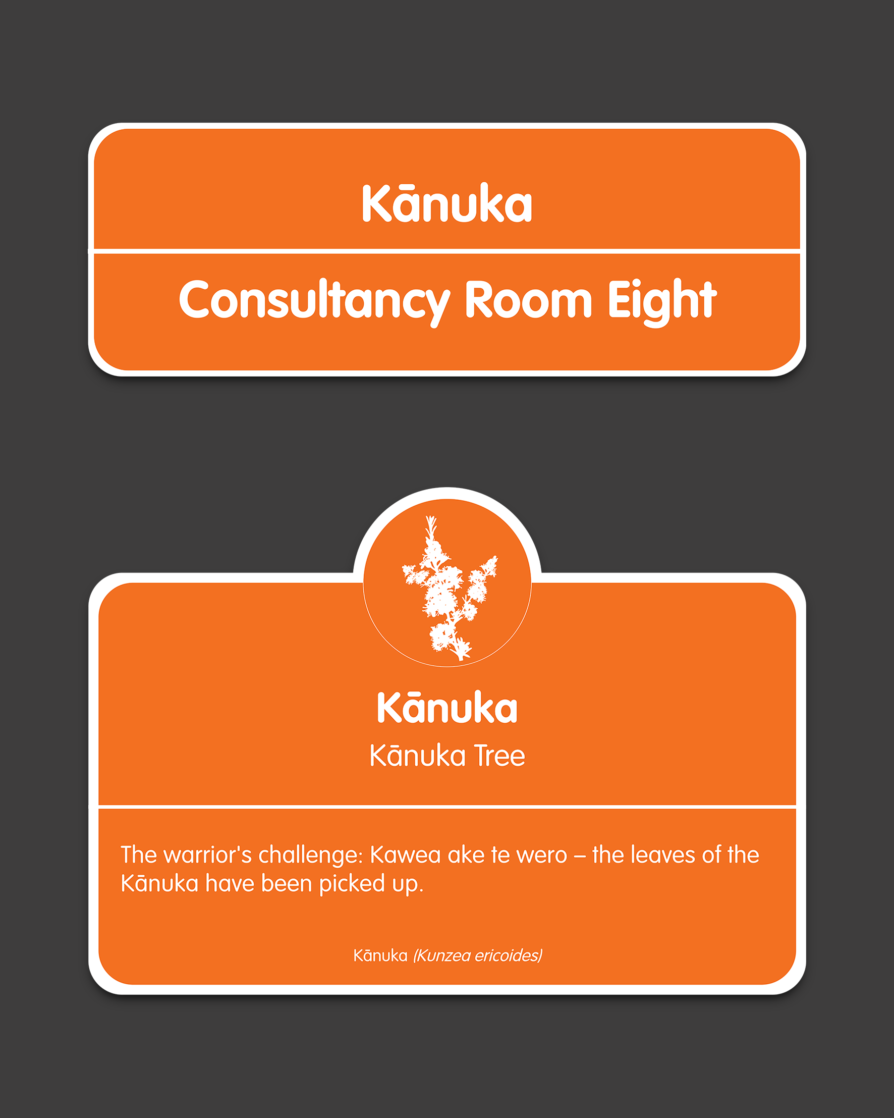
Wayfinding at Peke Waihanga
Wayfinding Design | Bilingual Conceptualisation | Art Direction
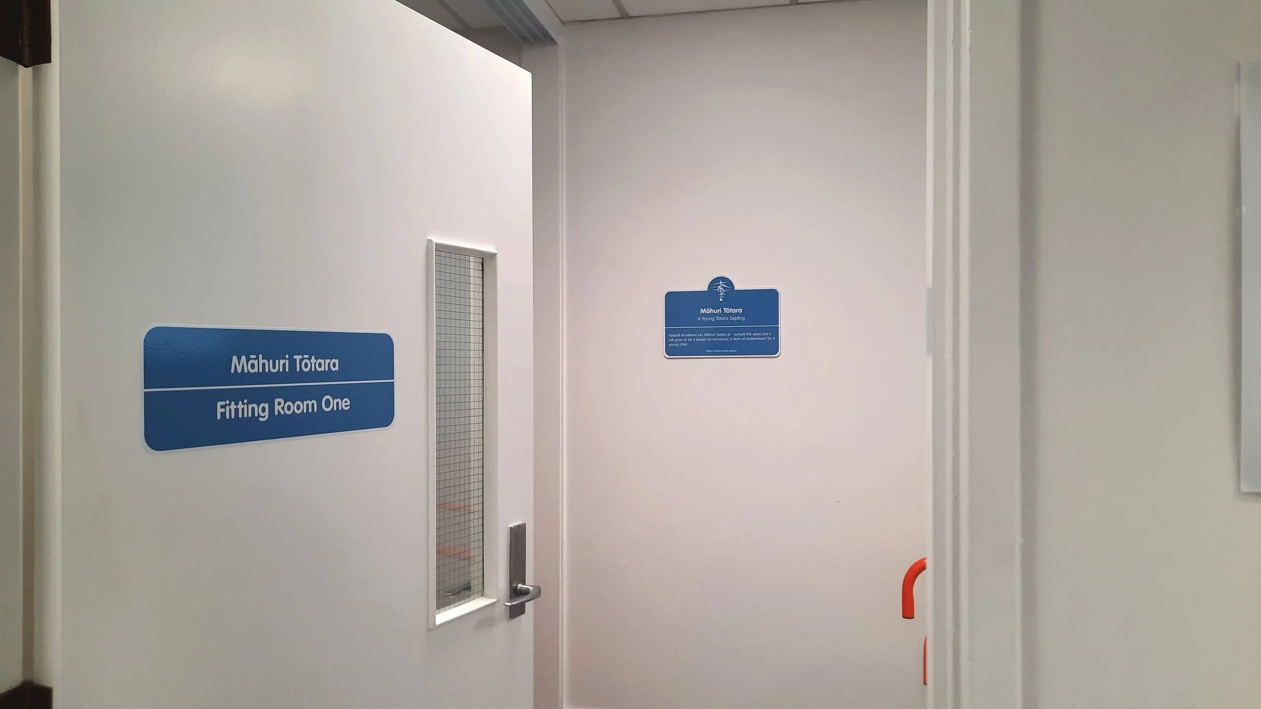
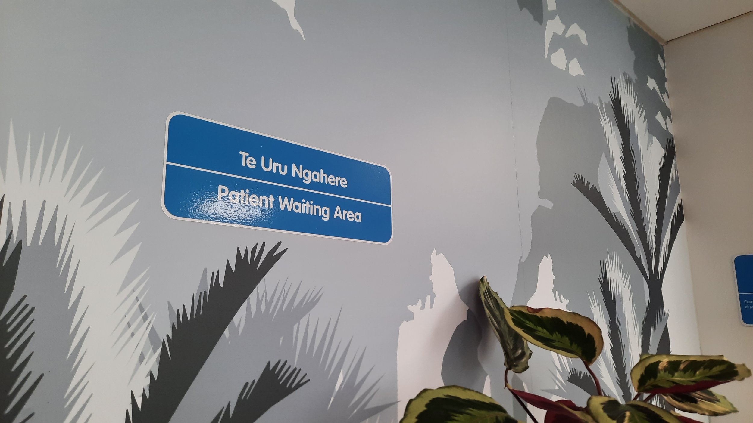
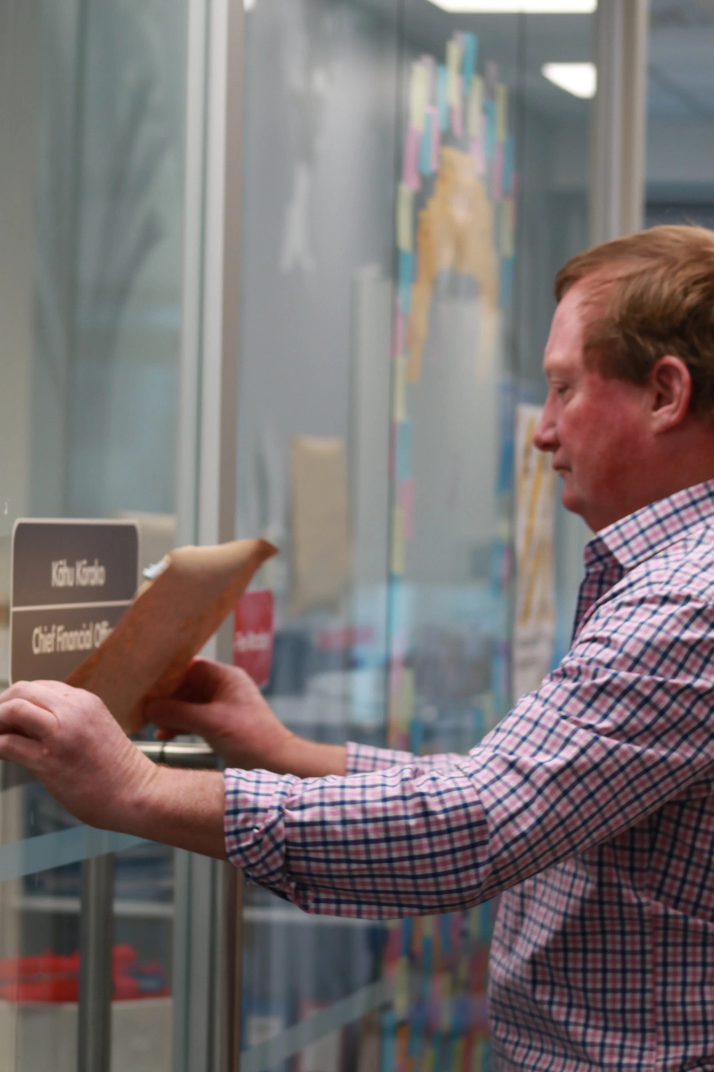
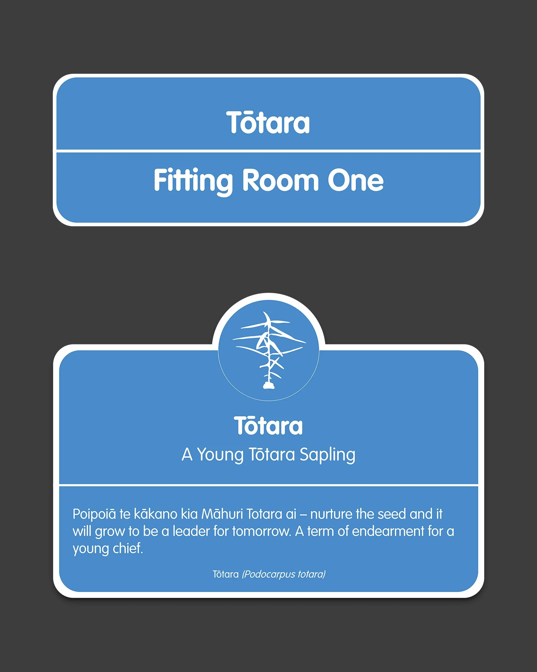
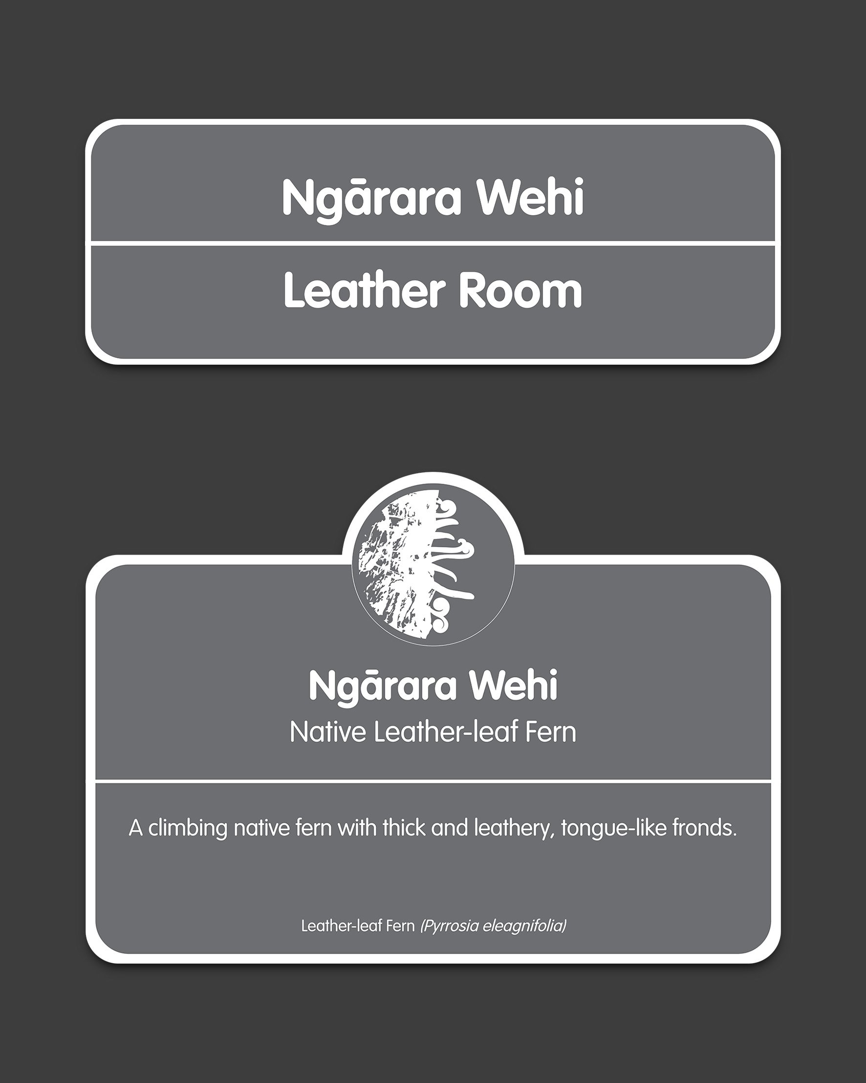
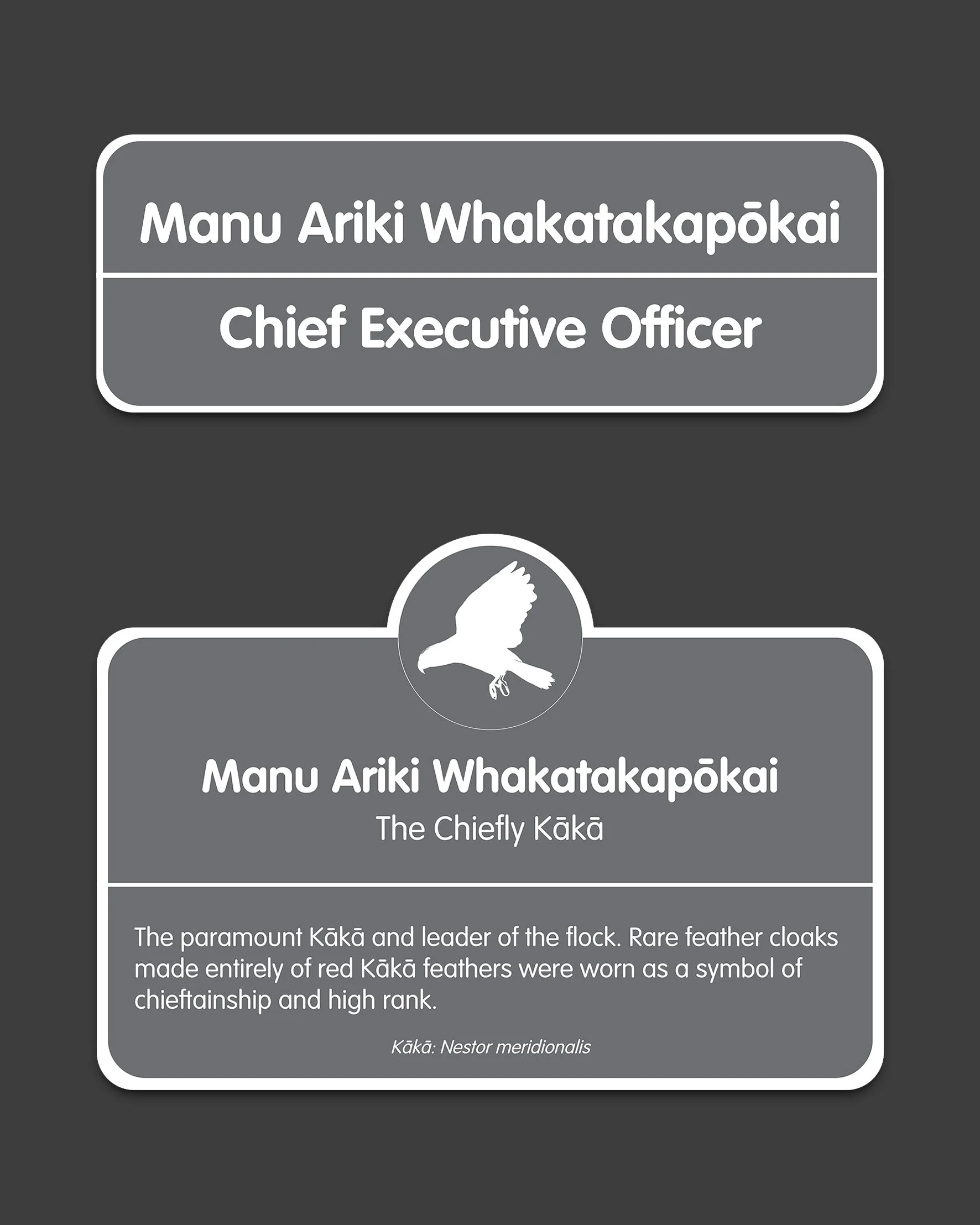
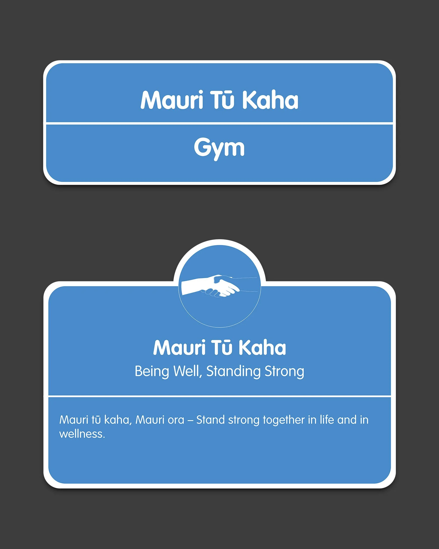
Bilingual Te Reo and English wayfinding signage are being rolled out centres around the country. It is an ongoing large-scale collaborative project that I worked on for over two years with our cultural advisor and our other graphic designer to build over 30 wayfinding signs for each centre. Due to the large scale of the project, I had to work both independently and collaboratively to ideate, develop and finish off the project.
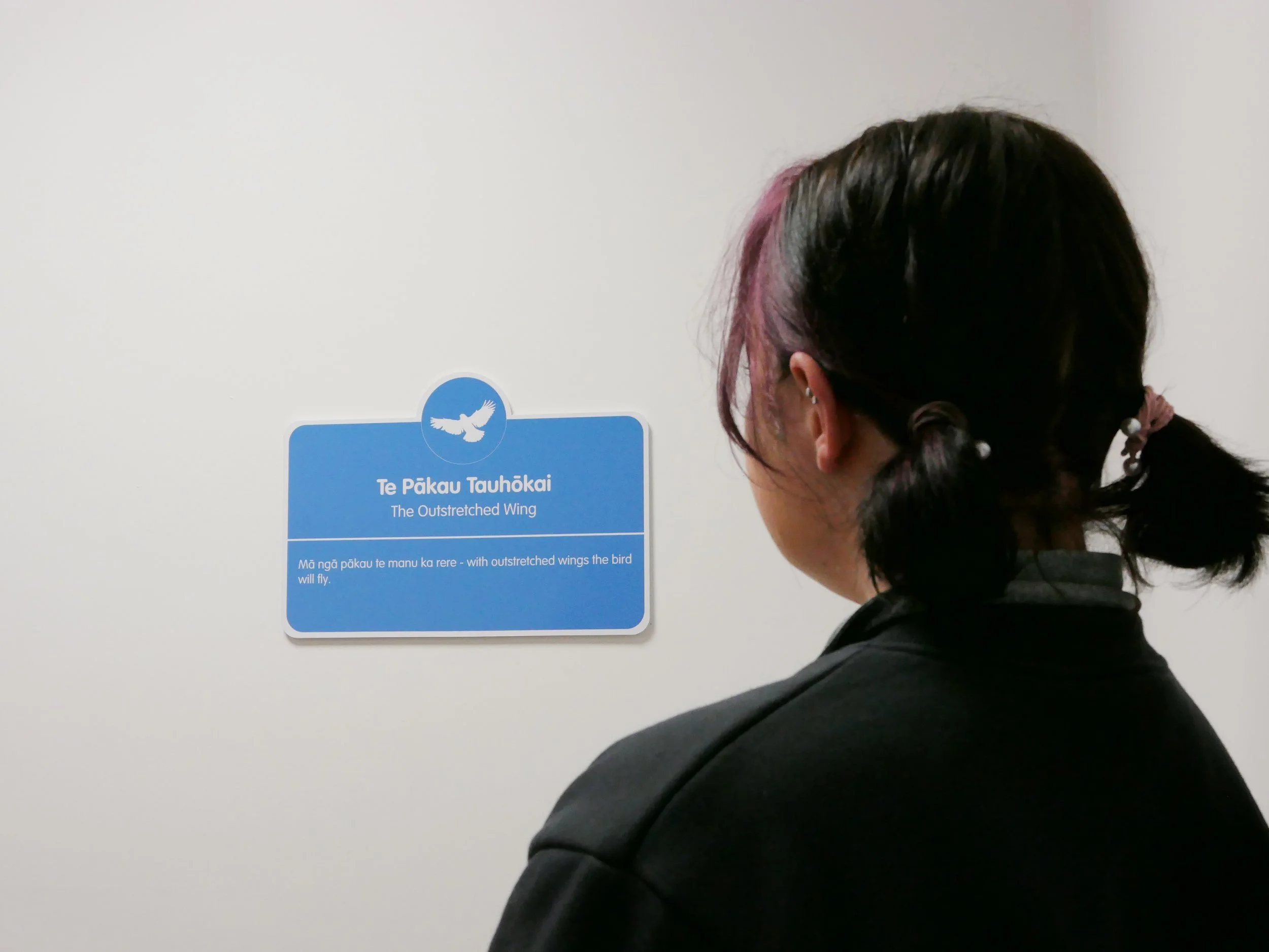
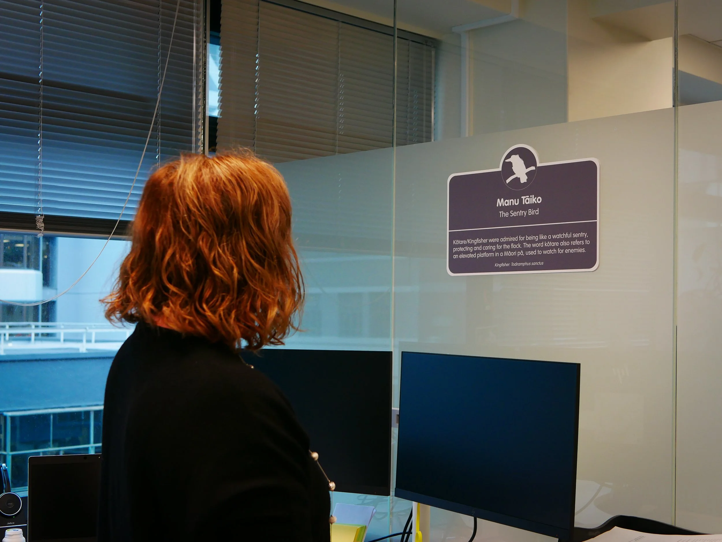
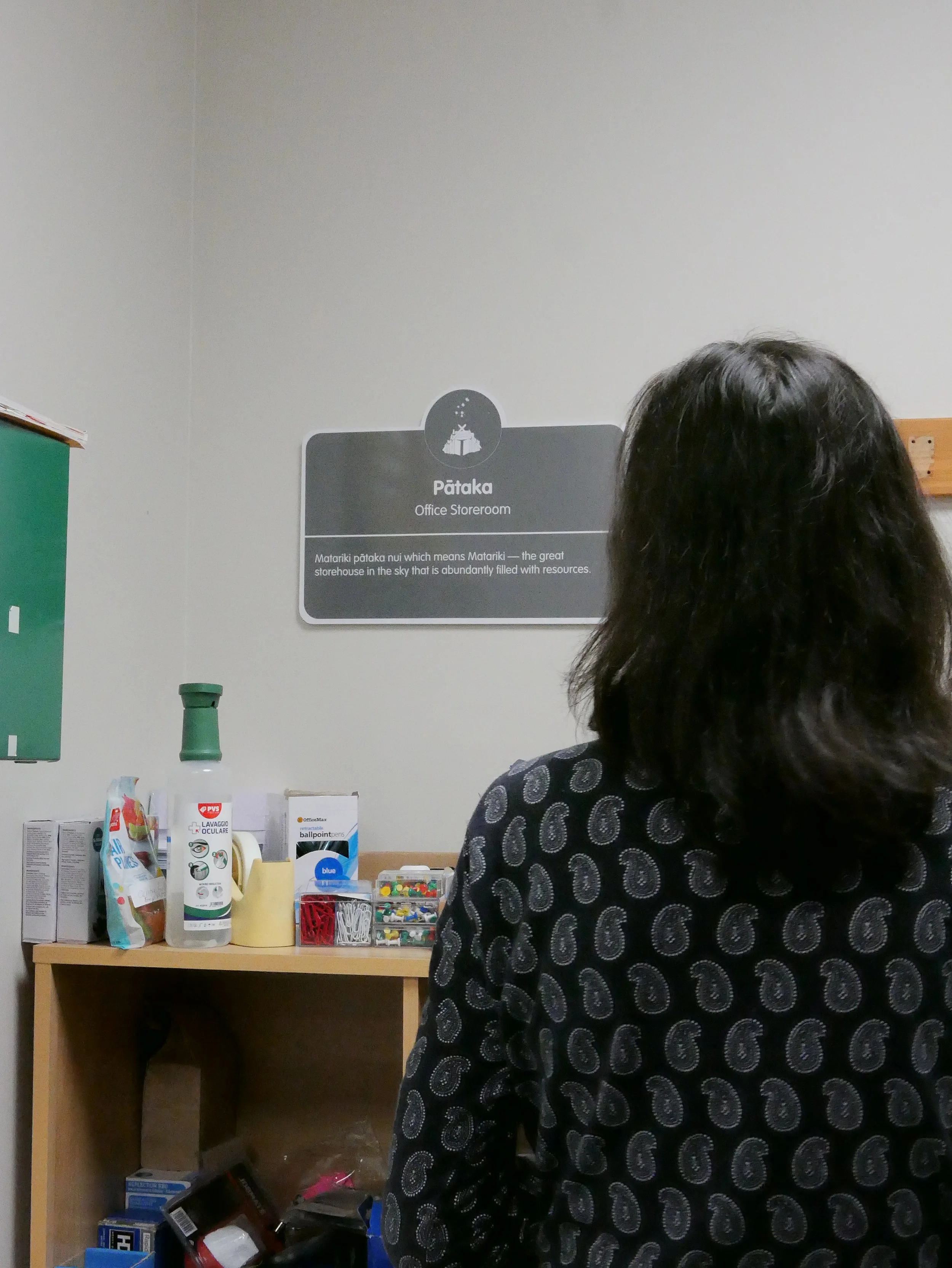
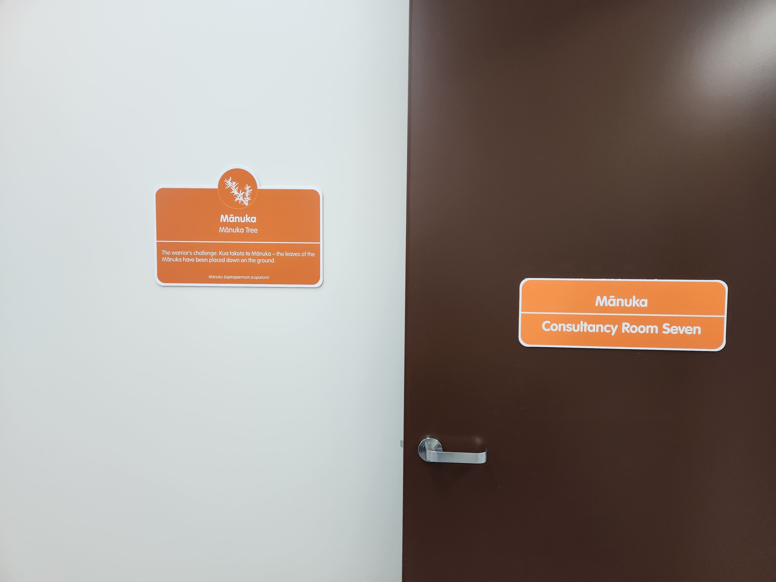
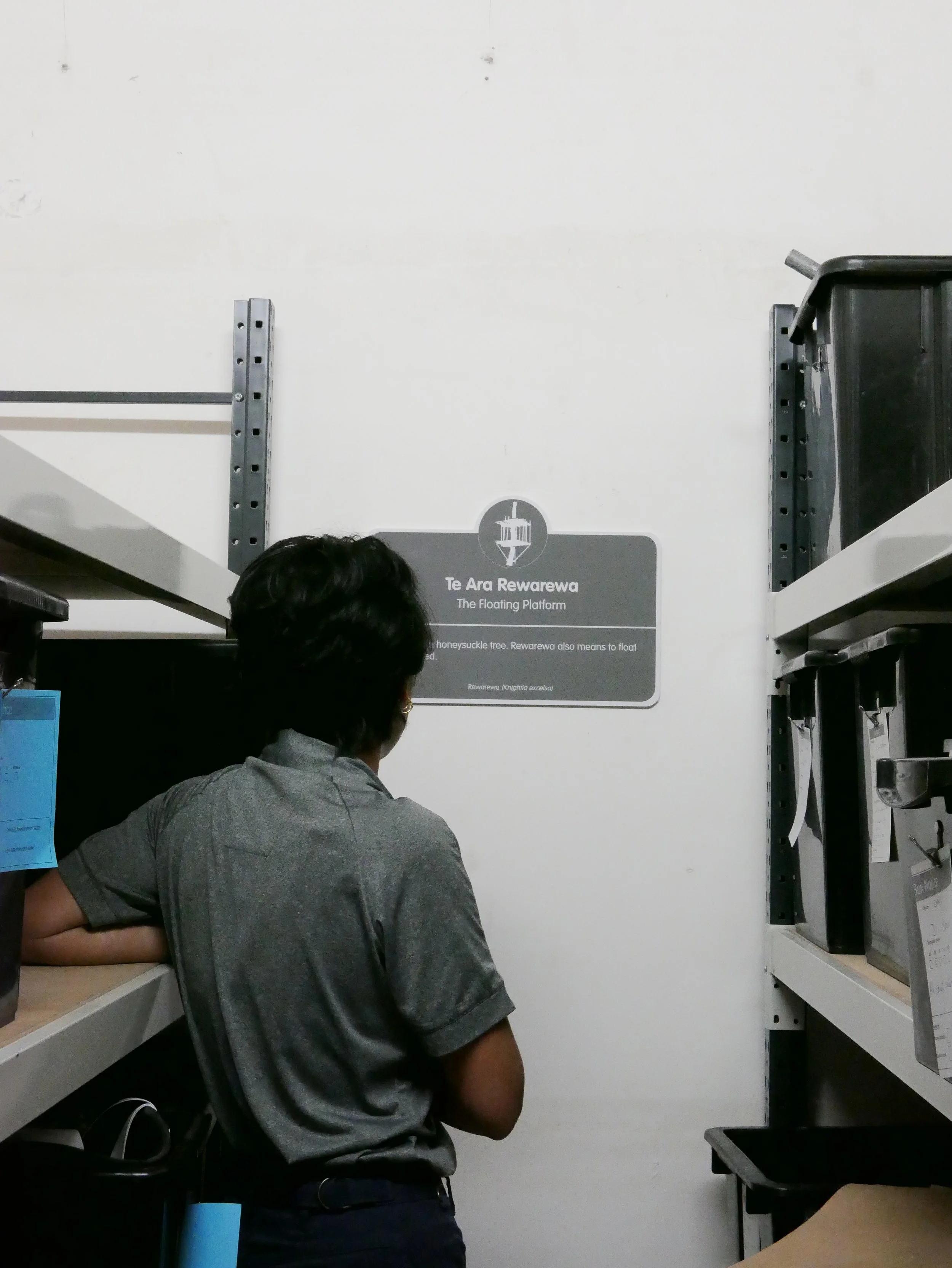
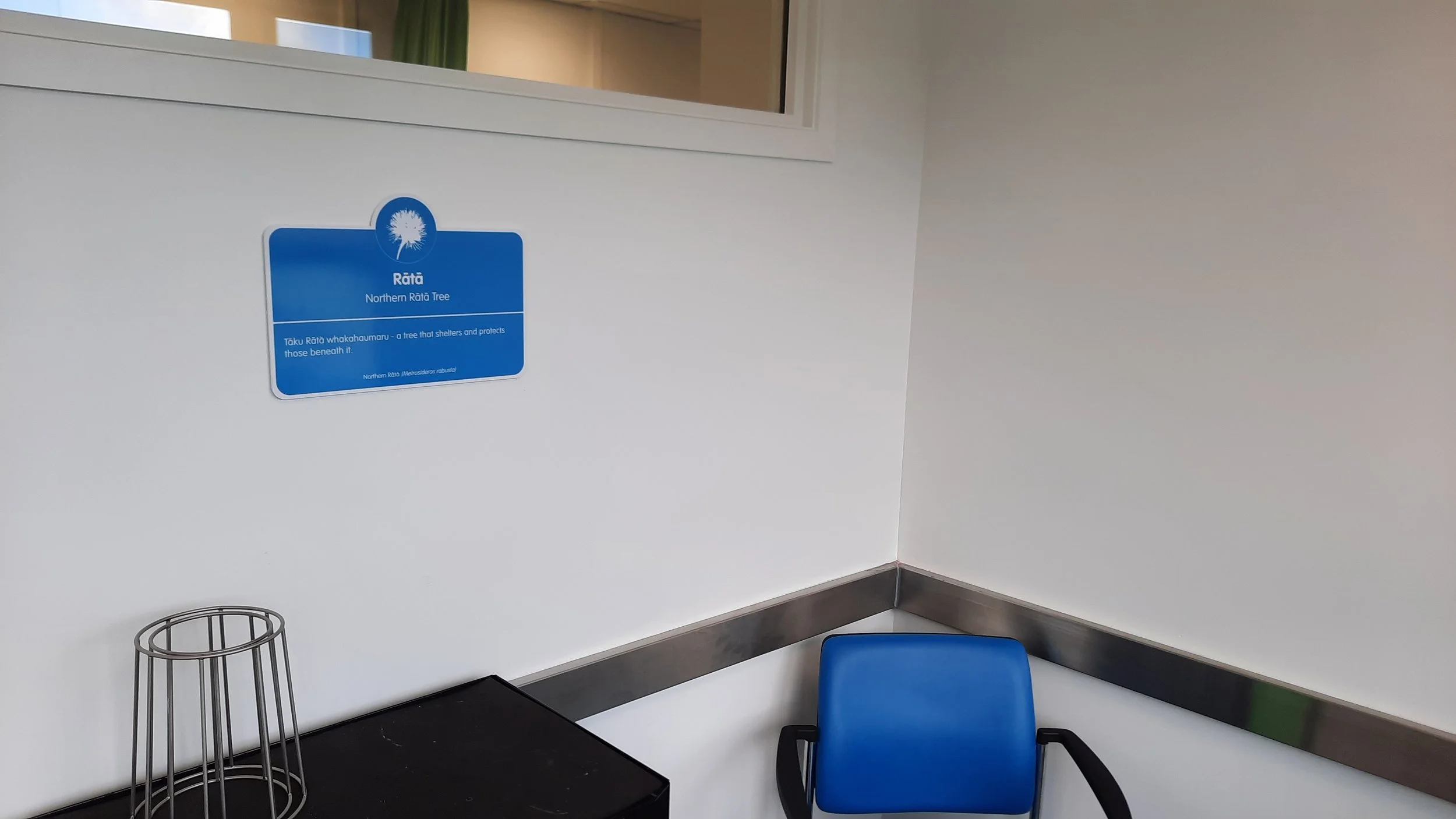
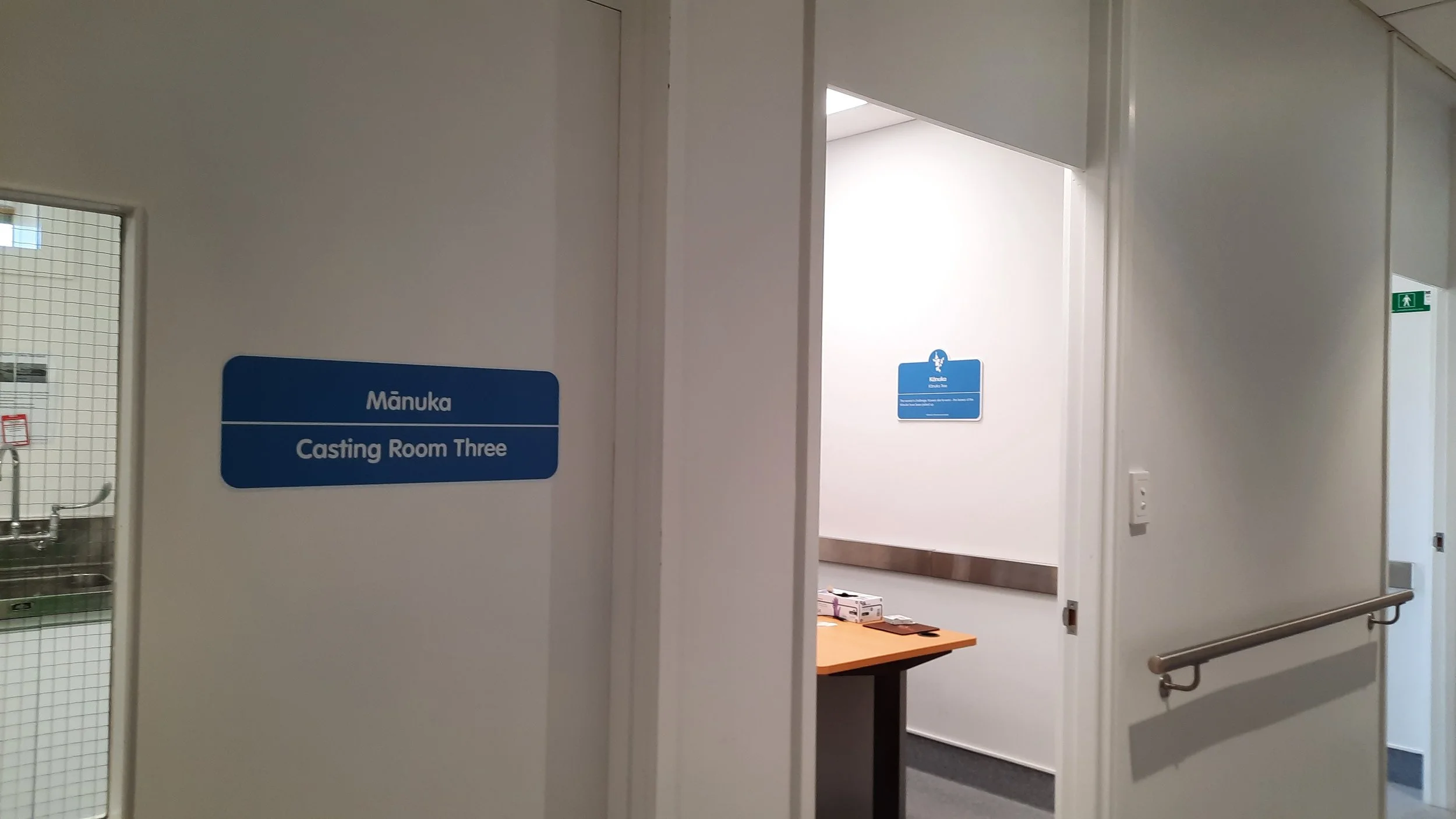
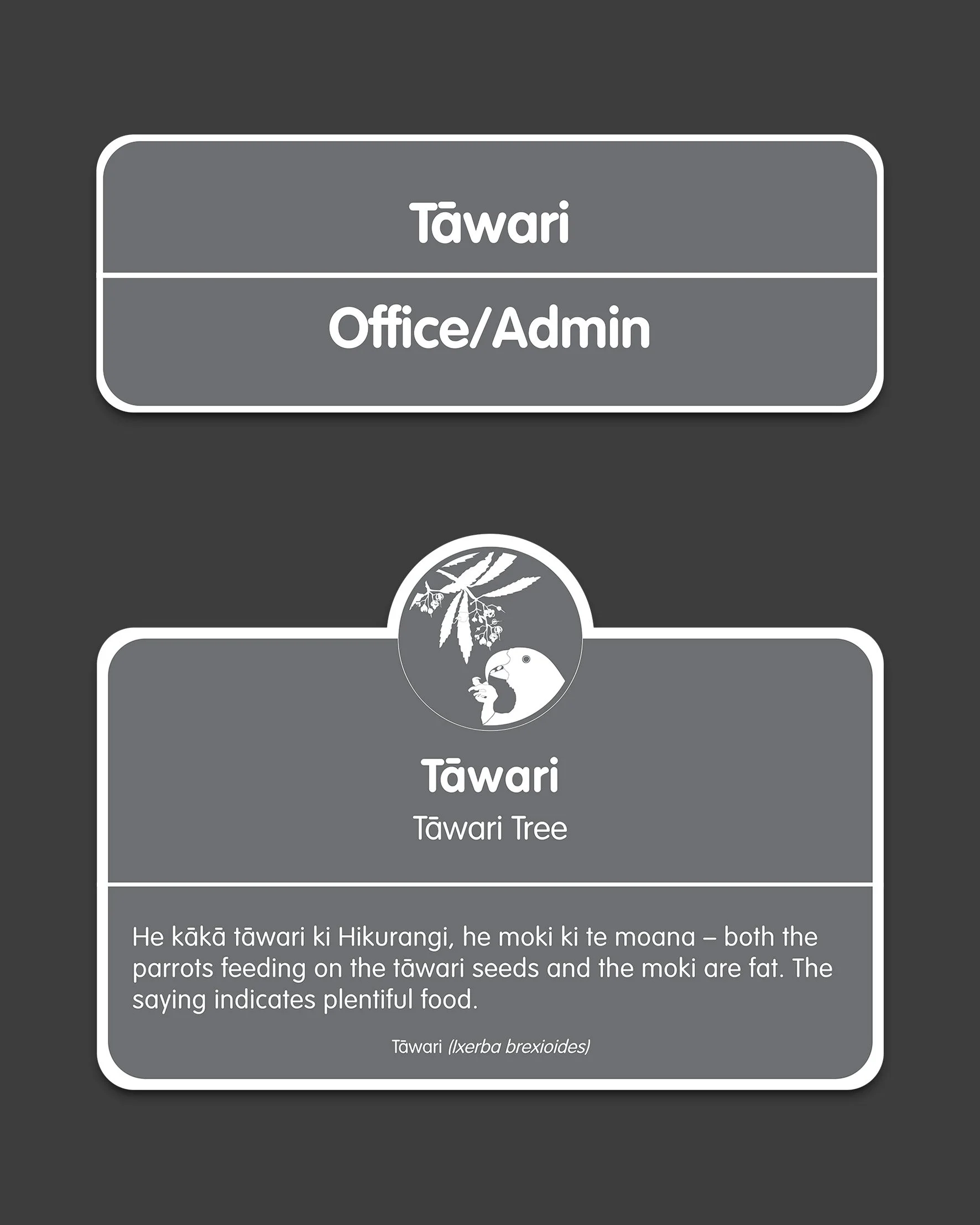
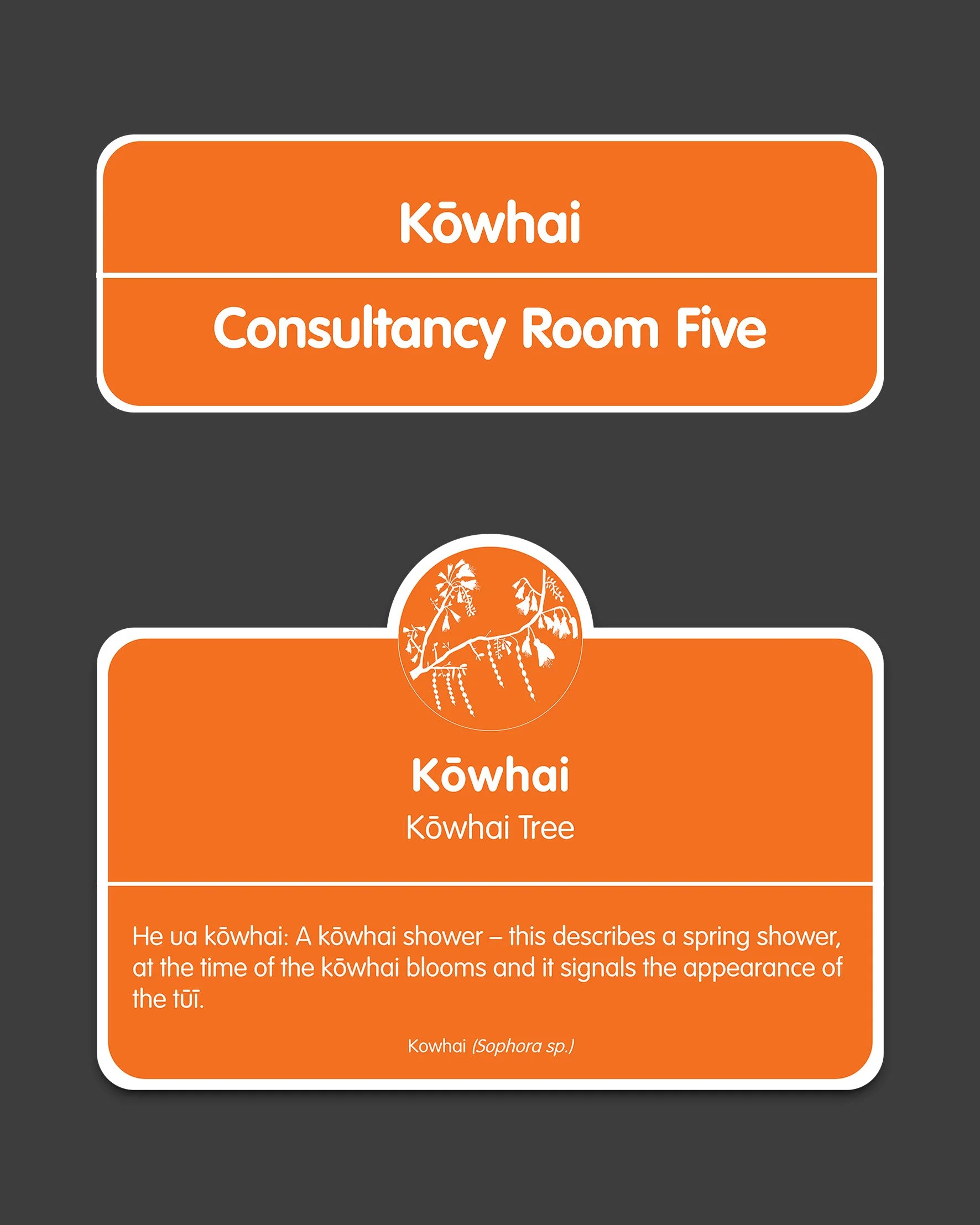
The signs are used to guide and identify spaces that are either patient-safe (blue for prosthetics and orange for orthotics) or staff-only (grey). They have been designed as labels for the front of each door that are accompanied by explanatory plaques.
We wanted to create something that visually doesn’t feel boring, is mana-enhancing and can capture attention as well as serve as a wayfinding memory of the room for patients and staff with the combination of visual, typography and illustration elements. At the same time, keeping in line with the Peke Waihanga branding and values.
The labels and plaques have been carefully thought out, designed, developed and reviewed multiple times to align with the cultural lens.


